Case Studies - Branding


Protein Detective // Calibre Scientific & Biozol
A Project spanning the course of 2 months, in which I assisted Biozol in revamping their extremely popular Coomassie Stain. This required the creation of both Print and Digital assets whilst also inventing a new product name and branding set, which needed to align with the vision of Calibre Scientific whilst also allowing for
a tremendous amount of creative freedom.
I created a branding style which I believe brings humour (a trademark
of the previous branding) and also an element of sophistication,
harking back to the stereotypical visuals of ‘Sherlock Holmes esque’
detective narratives.
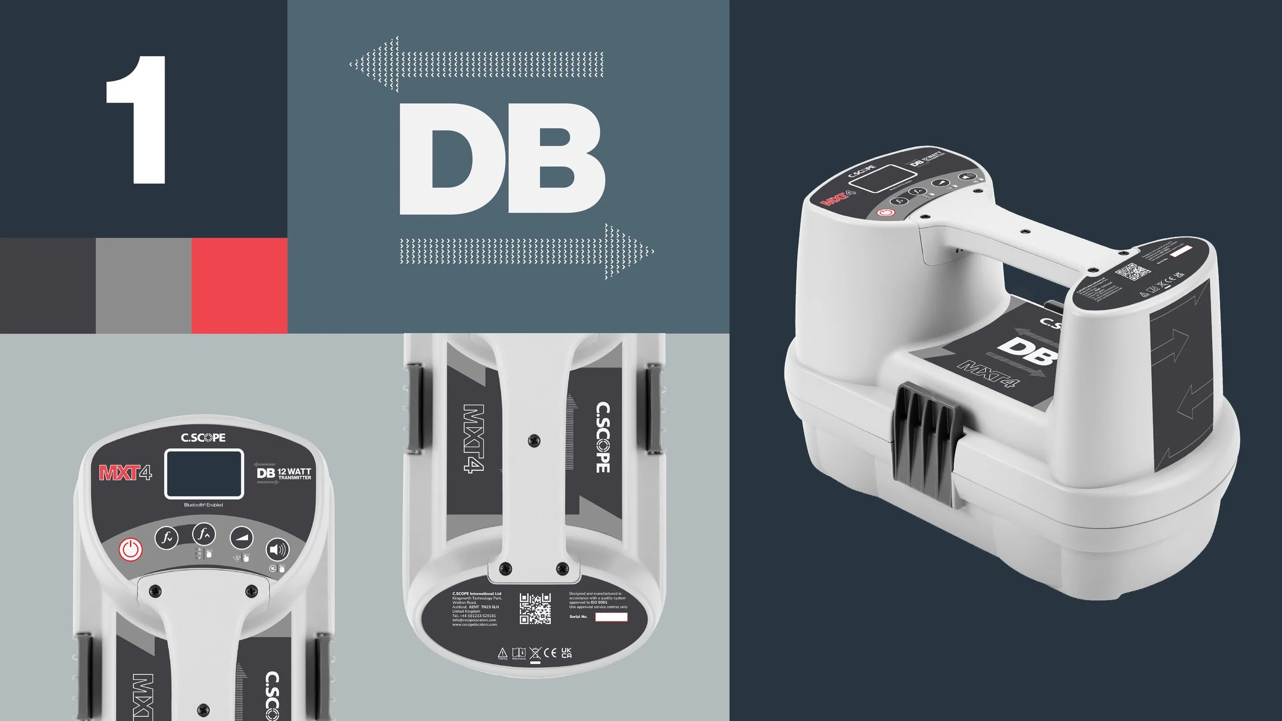
C.Scope DB // Developing a fresh brand voice for a new range of products.
As with any new branding task, the most important thing for me is to ensure a
clear communication between the brand and the customer base. C.Scope,
being a very well-established and respected manufacturer of both industrial and
leisure-focussed metal detectors, approached me to create a new branding set
and product labels for an upgraded line of their existing Transmitter series.
Project deliverables: Create an additional ‘DB’ logo to be used alongside the current branding on all upgraded products, with new product labels.


Concept Stage // Finding the voice.
I began the task by creating an extensive list of keywords that could potentially be associated with this line of products. The most significant were words such as ‘connectivity’, ‘Discovery’, and ‘Communication’.
The initial ideas and sketches encompassed the use of arrows to demonstrate an implied line of connection, with a bold logotype to demonstrate power.
Having the two arrows crossing in opposite directions enforced the product’s key feature of data-transfer.
Development Stage //
Enacting the Vision.
Following a consultation with the client on the concepting stage, I immediately began work on developing the ideas that were best received.
After extensive experimentation, it immediately became clear that primarily the logo’s legibility and simplicity would be paramount as it was to accompany an existing logotype in the form of the product itself. It was also crucial that the logo could be accompanied with the product’s wattage figure, which would further define the updates to the existing models.
In this case, I felt it was important to make the arrow ‘mark’ as dense as the bold logotype. The thinking was that by doing so, the negative space would create a box effect around the ‘DB’ mark, further enforcing the perception of ‘Power’ that I had hoped to convey here.

Final Stage // Project Delivery
Working with the client to simplify the design further, I eventually finalized a logomark that would be transferable between product models, and suitable for both print and digital assets.
This project allowed for extensive creativity but also an emphasis on designing for function. The audience of this product can be considered niche, in the sense that its use is largely restricted to a very particular demographic. The importance of keeping the intuitiveness by developing, rather than reimagining was paramount and the final product needed to align with this.
Rather than proposing branding that would disrupt, I believe I designed branding that served the client well, yet stood on its own, being obvious to the consumer that this line of products would be an upgrade on previous models.